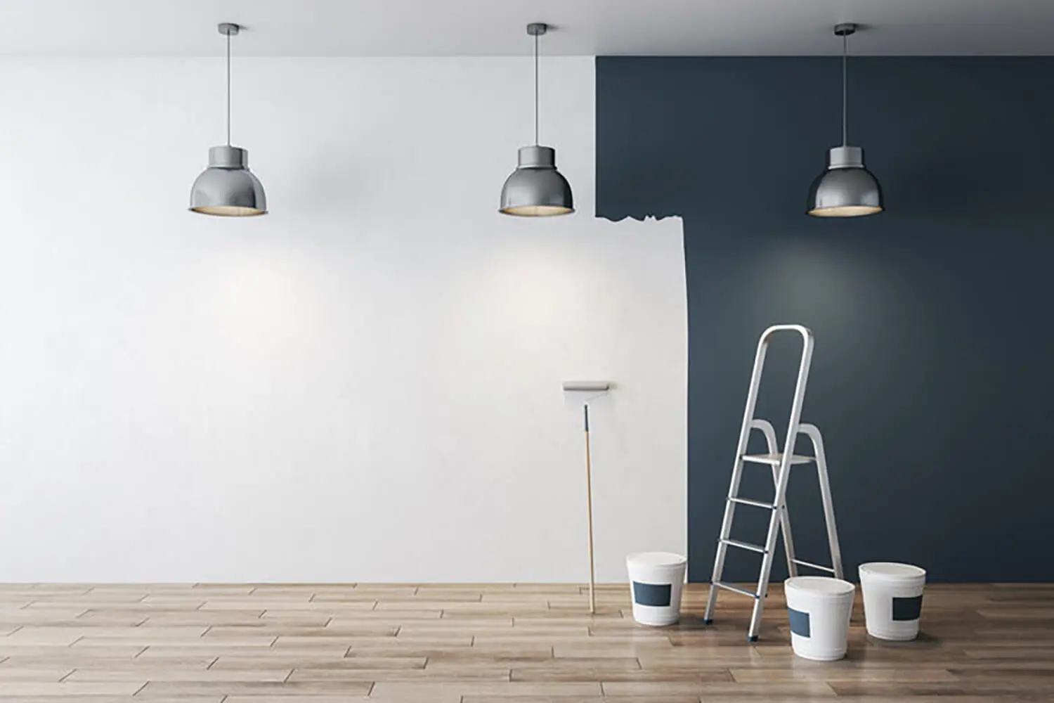
Paint Colors That Brighten Dark Rooms in Winter for Grand Rapids Homes
Winter in Grand Rapids can make even well-designed rooms feel darker, colder, and less inviting. Short days, heavy cloud cover, and low-angle sunlight change how color behaves indoors, often making walls look dull or shadowy. That’s why choosing paint colors that brighten dark rooms in winter isn’t just about style—it’s about comfort, mood, and how your home feels day to day during the longest season of the year.
Many homeowners struggle with rooms that suddenly feel smaller or gloomier once winter sets in. Spaces that felt fine in summer can look flat, gray, or overly cool when natural light drops off. That shift often leads to frustration and second-guessing when it’s time to pick a paint color that will actually work year-round.
The uncertainty usually comes from one key question: which colors will reflect limited light without making the room feel cold or washed out? Choosing the wrong shade can mean living with walls that amplify winter gloom instead of fighting it.
This guide is designed to help Grand Rapids homeowners make confident paint choices that improve brightness, warmth, and overall comfort throughout the winter months.
How Winter Light in Grand Rapids Changes the Way Paint Colors Look Indoors
Winter light in Grand Rapids behaves very differently than summer light, and that difference has a major impact on how paint colors appear inside your home.
Shorter days mean fewer hours of natural light entering your rooms. Even during daylight, the sun sits lower in the sky, which reduces how deeply light penetrates through windows.
Frequent overcast skies compound the issue. Cloud cover filters sunlight, softening contrast and muting color clarity throughout the day.
As a result, paint colors often look darker, flatter, or more muted in winter. Shades that felt balanced in summer can suddenly appear gray, dull, or heavier once winter lighting takes over.
North-facing rooms are especially affected. These spaces receive cooler, indirect light year-round, and winter exaggerates that effect. Colors in these rooms tend to lose warmth and depth more quickly.
Older Grand Rapids homes can intensify the problem. Smaller windows, deeper room layouts, and architectural features that block light make winter conditions even more noticeable.
This is why winter requires a different mindset when choosing paint. Colors selected under bright showroom lighting or summer sun may not perform the same way once winter arrives.
Successful winter-friendly choices account for:
- Reduced natural light throughout the day
- Cooler light temperatures from cloudy skies
- Increased reliance on artificial lighting
- The way shadows linger longer in low-light rooms
Understanding how winter light alters color perception is the foundation for choosing paint that truly brightens your home during the colder months.
Paint Color Options That Brighten Dark Winter Rooms
When rooms feel dim in winter, comparing paint colors one by one can get overwhelming fast. Organizing options by color family makes it easier to see what actually works in low light and what tends to fall flat.
Color names alone don’t tell the full story, which is why understanding interior paint color trends can help guide your selection before testing samples on your walls. Two paints labeled “light gray” or “warm white” can behave very differently once they’re on the wall in winter conditions. What matters most is undertone and how much light the color reflects.
Undertones influence whether a room feels warmer or colder. Subtle yellow, beige, or red undertones usually help colors feel brighter and more inviting during winter. Gray or blue undertones often mute warmth and can exaggerate shadows.
Light reflectivity also plays a major role. Lighter colors bounce available light around the room, which helps reduce dark corners and heavy-looking walls. This doesn’t mean everything has to be white, but it does mean depth and saturation need to be controlled.
The goal is balance. Paint that’s too dark absorbs light, while paint that’s too cool can feel sterile or flat in winter. The best winter paint colors brighten spaces while still adding enough warmth to feel comfortable.
When evaluating options, homeowners should focus on:
- How the color looks in indirect or artificial light
- Whether undertones lean warm or cool
- How the shade changes from morning to evening
- How it interacts with flooring, trim, and furnishings
By narrowing choices to proven color families, it becomes much easier to select paint colors that brighten dark rooms in winter without sacrificing warmth or style.
1. Soft Whites and Off-Whites
White is often the first choice for dark rooms, but winter light can make pure white look gray or cold. This is especially common in Grand Rapids homes during overcast months.
Soft whites and off-whites perform better because they include subtle warm undertones. These undertones help walls reflect light without feeling stark.
Warm undertones that work well include:
- Creamy or ivory bases
- Light beige or almond hints
- Gentle warmth that doesn’t read yellow
These shades keep rooms feeling brighter while still comfortable and inviting.
Soft whites are a strong option for:
- North-facing living spaces
- Bedrooms with limited winter sunlight
- Hallways and stairwells with few windows
A common mistake is choosing white from a paint chip alone. Winter lighting often changes how white appears once it’s on the wall.
Ignoring nearby surfaces is another issue. Flooring, trim, and cabinetry can push a white toward gray if undertones aren’t balanced.
Testing samples in multiple spots and viewing them throughout the day helps ensure the color stays bright during winter afternoons.
2. Warm Neutrals
Cool grays are popular, but they often struggle in Grand Rapids winters. In low light, they can look flat, darker than expected, or slightly blue.
Warm neutrals offer a better balance. Beige, greige, and light taupe add warmth without making rooms feel heavy or dim.
These colors work because they:
- Reflect light better than darker neutrals
- Add warmth without feeling yellow
- Stay consistent under artificial lighting
To spot a warm neutral, look for undertones that lean beige or soft brown rather than blue or green. Comparing samples side by side usually makes the difference clear.
Warm neutrals perform especially well in:
- Living rooms and family rooms
- Open-concept spaces with uneven light
- Bedrooms that feel cold in winter
A common mistake is choosing a neutral that looks “safe” but leans cool. In winter, that choice often makes rooms feel less inviting instead of brighter.
Testing warm neutrals in morning and evening light helps confirm they maintain warmth throughout the day.
3. Pale Yellows and Creamy Tones
Soft yellow undertones can mimic the feeling of natural sunlight, which makes them especially helpful during dark winter months.
Muted, creamy yellows work best. Bright or saturated yellows tend to feel overpowering and can look harsh in low light.
Well-chosen pale yellows help:
- Lift dark rooms without feeling bold
- Add warmth to shaded spaces
- Improve overall mood in winter
These tones work particularly well in:
- Kitchens with limited daylight
- Breakfast nooks or dining areas
- Smaller rooms that feel closed-in
The biggest pitfall is going too strong. Yellow that looks subtle on a sample card can feel intense once it covers all four walls.
Another issue is pairing yellow with cool trim or flooring, which can make the walls look muddy instead of bright.
Sticking with soft, creamy versions keeps the space warm, light, and balanced throughout the winter season.
4. Light Blues and Greens
Light blues and greens can work in winter, but only when the undertones are chosen carefully. The wrong shade can quickly make a room feel colder or dimmer.
Muted versions perform best. Soft sage, pale green, or blue with a hint of warmth tends to reflect light without feeling icy.
These colors work well because they:
- Feel calm without going gray
- Add subtle color without darkening the room
- Stay more balanced under artificial lighting
Avoid shades with strong blue or gray bases. In winter light, those tones often look flat or shadowy.
Light blues and greens are best used in:
- Bedrooms where a relaxed feel matters
- Bathrooms with limited natural light
- Home offices that need brightness without distraction
Testing is especially important with these colors. What looks fresh in summer can feel cool and muted during winter afternoons.
When chosen correctly, soft blues and greens can brighten a space while still feeling comfortable during colder months.
Why Paint Finish Matters as Much as Color in Dark Winter Rooms
Paint finish has a direct impact on how much light a room reflects, which becomes especially noticeable during Grand Rapids winters. Even the right color can look dull if the finish absorbs too much light.
Flat finishes tend to soak up light. In dark winter rooms, this can make walls feel heavier and reduce brightness, especially in spaces with limited natural light.
Eggshell and satin finishes usually perform better. They offer a soft sheen that reflects light gently without highlighting wall imperfections.
Semi-gloss finishes reflect the most light, but they’re best reserved for trim and doors. On large wall surfaces, too much shine can feel harsh or uneven.
The key is balance. A slight sheen helps bounce artificial and natural light around the room, making colors feel cleaner and more vibrant during winter months.
Finish choice also affects how color depth shows up, just as environmental factors like humidity can influence paint performance indoors, as explained in how humidity affects interior paint. A satin version of the same paint color will often look brighter than a flat version, even though the color formula is identical.
In low-light rooms, pairing a winter-friendly color with the right finish can noticeably improve brightness without changing the shade itself.
Rooms in Grand Rapids Homes That Benefit Most From Winter-Brightening Colors
Some rooms feel the effects of winter more than others, especially in Grand Rapids homes where natural light can be limited for months at a time.
Basements are one of the biggest problem areas. Small windows, below-grade walls, and heavy shadows make darker colors feel even heavier in winter. Lighter, warmer shades help counteract that closed-in feeling.
North-facing rooms also struggle year-round, but winter amplifies the issue. These spaces receive cooler, indirect light, so paint colors need extra warmth to avoid looking flat or gray.
Room size and ceiling height matter as well. Smaller rooms or spaces with low ceilings benefit from lighter colors that reflect light upward and outward, helping the room feel more open.
Window placement plays a role too. Rooms with only one light source or windows blocked by neighboring homes often need brighter, more reflective colors to feel comfortable in winter.
Paint strategy should also match the room’s function. Living areas and kitchens benefit from warmth and brightness, while bedrooms may need a softer balance that still avoids feeling cold.
Using the same paint color throughout the entire home often fails in winter. Different rooms experience light differently, and adjusting color choices by space usually leads to better results and a more cohesive feel overall.
Why Professional Color Selection and Application Makes a Difference in Winter
Winter lighting makes color selection less forgiving, which is why professional guidance often leads to better results. Experienced painters consider how overcast days, window direction, and artificial lighting will affect color once it’s on the wall.
Surface preparation is another major factor. Imperfections, patchy repairs, or uneven texture can absorb light and cause color to look dull or inconsistent in winter conditions.
Application technique also affects how bright a room feels. Uneven coverage or thin coats can make even light colors appear darker or patchy when natural light is limited.
Professionals focus on a few key details that homeowners often overlook, such as understanding interior painting costs and expectations before getting started:
- Evaluating color performance under winter lighting
- Preparing surfaces to maximize light reflection
- Applying paint evenly for consistent color depth
This attention to detail helps ensure the finished color looks intentional and balanced, rather than flat or disappointing once winter sets in.
Choosing Paint Colors That Keep Your Home Brighter All Winter Long
Winter light in Grand Rapids changes how paint behaves, and understanding that shift makes color decisions much easier. Short days, cloud cover, and low-angle sun all reduce brightness and flatten color if the shade isn’t chosen carefully.
Paint colors that brighten dark rooms in winter tend to share a few traits. They reflect light well, include warm or balanced undertones, and avoid heavy saturation that absorbs light.
Soft whites and off-whites help bounce limited light without feeling stark. Warm neutrals add comfort and depth without darkening a space. Pale yellows and creamy tones introduce subtle warmth that mimics sunlight. Carefully chosen light blues and greens can work too, as long as they don’t lean too cool or gray.
Finish matters just as much as color. A slight sheen can enhance brightness and make colors feel cleaner during winter months, while overly flat finishes often mute light.
The most important takeaway is that winter-friendly paint choices are intentional. They consider light, room orientation, and how spaces are actually used during the season when you’re home the most.
With the right color family and finish, your home can feel brighter, warmer, and more comfortable all winter long—without relying on extra lighting or constant redecorating.
If you’re ready to brighten your home this winter, TNC Painting can help. We work with homeowners to choose paint colors that perform well in low light and feel comfortable all season long. Our team handles proper prep, clean application, and a smooth process from start to finish. If you want your interior paint to look brighter and more inviting during Grand Rapids winters, we’re happy to walk you through your options and provide a clear, professional estimate.