5 Interior Paint Colors That Make Cold Rooms Feel Warmer
Winter has a way of exposing certain rooms in a home. Even when the heat is running, some spaces still feel cold, flat, or uninviting. North-facing rooms, shaded areas, and spaces with limited natural light tend to amplify that problem, making them feel chilly no matter the thermostat setting.
Trends in interior paint colors show how much the right choice influences the feel of a room. While paint won’t physically raise the temperature, it strongly affects how warm or cold a room feels visually and psychologically. The right tones can soften harsh winter light, reduce that gray cast, and make a space feel more comfortable and lived-in during colder months.
That’s why choosing interior paint colors that make cold rooms feel warmer is less about trends and more about understanding undertones, light reflection, and balance. A shade that looks perfect in summer sunlight can feel stark and unwelcoming in winter if the undertones are wrong.
This guide breaks down specific color families that consistently help cold rooms feel cozier. You’ll see which shades work best, why they create a sense of warmth, and where they tend to perform well inside a home. If you’ve been struggling with rooms that never quite feel comfortable in winter, the solution may be simpler than you think.
Soft Creams and Warm Off-Whites
White walls are often the first choice for brightening a room, but not all whites behave the same in winter. In cold, low-light conditions, cool whites can feel stark and slightly blue, which exaggerates the sense of chill. Soft creams and warm off-whites avoid that problem by relying on subtle undertones rather than pure brightness.
Warm undertones matter more than how light the color looks on a swatch. Creams with hints of yellow, ivory, or soft beige counteract the gray cast that winter light brings into a room. Instead of reflecting cold daylight, these colors soften it, making walls feel gentler and more welcoming.
These shades also perform well when natural light is limited. In rooms with small windows or north-facing exposure, warm off-whites help bounce light around, similar to how fresh interior paint ideas can brighten a space. The result is a room that feels brighter and warmer at the same time, rather than washed out.
Soft creams and warm off-whites work best in:
- Living rooms that feel drafty or shaded
- Hallways with little to no natural light
- Open spaces where you want continuity without cool tones
Because they’re neutral, these colors also pair easily with wood floors, warm metals, and layered textiles. That flexibility makes them a reliable option when you want warmth without committing to a deeper or more saturated wall color.
Warm Greige and Beige Tones
Gray became popular for its clean, modern look, but many gray interiors feel noticeably colder in winter. The difference comes down to undertones. Warm greige and beige tones blend soft gray with beige or taupe, creating a balanced neutral that avoids the icy feel of true cool gray.
Greige behaves differently in winter light because it doesn’t lean blue. When daylight is weak or overcast, these tones hold onto warmth instead of flattening out. Beige-forward greige shades feel grounded and comfortable, especially in rooms that rely on artificial lighting for much of the day.
These colors also create visual balance. They’re deep enough to add warmth, but still neutral enough to keep rooms feeling open rather than heavy. Instead of making walls disappear like cool gray often does, warm greige gives a subtle sense of depth that helps a room feel more finished and intentional.
Warm greige and beige tones work especially well in:
- Family rooms where comfort matters more than brightness
- Dining areas that feel cool or echoey
- Open-plan spaces where multiple rooms need to flow together
Because these tones sit in the middle ground, they adapt well to changing seasons. They feel cozy in winter without becoming dull in summer, making them a practical long-term choice for shared living areas.
Muted Terracotta and Clay-Inspired Neutrals
Earthy colors naturally feel warmer because they echo materials we associate with the outdoors and natural heat. Muted terracotta and clay-inspired neutrals bring that warmth indoors without overwhelming a space. In winter, these pigments counteract cold light by adding visual weight and softness to the walls.
The key is choosing muted versions rather than bold or saturated terracotta. Strong orange or red tones can feel intense and limiting, especially in smaller rooms. Muted clay shades are toned down with beige, taupe, or gray, which makes them more livable and easier to integrate with existing finishes.
These colors create a cozy, grounded feeling that works especially well when winter light is dim or indirect. Instead of reflecting light sharply, earthy neutrals absorb and diffuse it. That absorption reduces glare and helps the room feel calmer and warmer overall.
Muted terracotta and clay-inspired neutrals are a good fit for:
- Bedrooms that feel cold or impersonal
- Reading nooks or sitting areas used in the evening
- Accent walls that need warmth without dominance
When paired with soft lighting and natural textures, these tones add depth and comfort. They’re ideal for homeowners who want warmth without relying solely on traditional cream or beige walls.
Taupe and Mushroom Shades
Taupe and mushroom shades sit in a sweet spot between light and dark, which gives them a natural advantage in cold rooms. Their added depth helps walls feel more substantial, especially during winter when light tends to be flatter and less forgiving. Instead of bouncing light back harshly, these tones absorb just enough to soften the space.
That depth is what makes them feel warmer than lighter neutrals. Pale colors can sometimes emphasize shadows and make a room feel hollow, while taupe-based shades create visual weight. This makes walls feel closer and more enclosing, which subtly increases the sense of comfort.
Mushroom tones are particularly effective because they blend warm brown, gray, and beige undertones. That mix prevents the color from swinging too cool or too muddy. In winter light, these shades stay stable and consistent, avoiding the color shifts that make some neutrals feel unpredictable.
These tones tend to perform best in rooms where you want a calm, enveloping feel. Home offices, bedrooms, and smaller living spaces often benefit from taupe or mushroom walls because they reduce visual contrast and make the room feel settled. When paired with warm lighting and soft furnishings, these shades help cold rooms feel noticeably more comfortable without becoming dark or heavy.
Warm-Toned Blues and Green-Greys
Blue and green often get dismissed as “cold” colors, but undertones matter far more than the color family itself. Warm-toned blues and green-greys include subtle hints of yellow, brown, or gray that keep them from feeling icy in winter light. When chosen correctly, they can feel calm and cozy rather than chilly.
The problem with many traditional blues is their blue or violet base, which becomes more pronounced in low, gray winter daylight. Warm-leaning versions soften that effect. Green-greys with an earthy base or blues with a slight teal influence tend to hold warmth even when sunlight is limited.
These shades also work well when neutral palettes start to feel repetitive. They add personality while still behaving like neutrals, which makes them easier to live with long term. Instead of competing with furniture or flooring, warm-toned blues and green-greys act as a backdrop that feels intentional and grounded.
They’re often a better choice than traditional warm neutrals in rooms where you want a soothing atmosphere without beige or cream. Bedrooms, bathrooms, and quieter living areas benefit from their calming quality, especially when paired with warm bulbs and natural textures. In winter, they provide depth and comfort without closing the room in.
Why These Colors Work Better With the Right Finish and Lighting
Paint color doesn’t exist in isolation. The finish you choose and the lighting in the room can either support warmth or completely undermine it, especially in winter. Even the best color choice can feel cold if the surrounding conditions aren’t considered.
Sheen plays a bigger role than most people expect. Higher-gloss finishes reflect more light, which can exaggerate cool highlights and make walls feel slick or harsh in winter. Flat and eggshell finishes diffuse light instead of bouncing it, softening shadows and making warm tones feel richer and more consistent throughout the day.
Lighting temperature is just as important. Cool, blue-leaning bulbs can drain warmth from even the coziest paint color. Warm white or soft white lighting enhances undertones and helps colors read the way they’re intended to. This is especially noticeable in rooms that rely heavily on artificial light during shorter winter days.
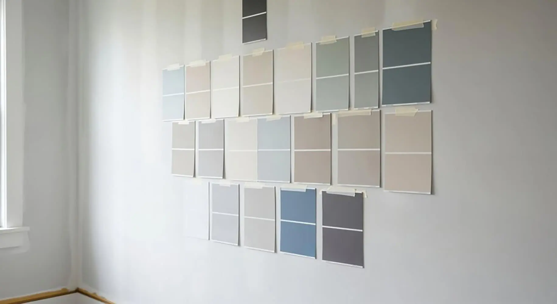
One common mistake homeowners make is testing samples without accounting for these factors. A color tested under bright showroom lighting or summer sunlight may look completely different once winter arrives. Samples should always be viewed at different times of day, with the actual bulbs and finishes planned for the room. That context is what allows warm colors to do their job effectively.
Choosing Paint That Changes How a Room Feels
Cold rooms are rarely uncomfortable because of temperature alone. More often, they feel uninviting because of how light, color, and contrast interact. Paint influences that experience on a psychological level, shaping whether a space feels open and stark or calm and welcoming.
The colors discussed here work because they reduce visual chill. Warm undertones soften gray daylight, add depth where winter light falls flat, and help walls feel closer and more grounded. Instead of fighting the season, these shades work with it, creating balance rather than brightness for its own sake.
It’s also important to view these colors as a group rather than isolated options. Creams, greiges, earthy neutrals, deeper taupes, and warm-toned blues all solve the same problem in different ways. The right choice depends on how much light a room gets, how it’s used, and how enclosed or open it feels.
When choosing paint with warmth in mind, focus less on labels and more on behavior. How does the color react in low light? Does it shift cooler at night? Does it feel stable across different walls? Those answers matter more than the name on the swatch.
With thoughtful selection, paint becomes one of the simplest ways to make a cold room feel more comfortable, balanced, and livable throughout winter.
If your home has rooms that never quite feel comfortable in winter, we can help. At TNC Painting, we work with homeowners to choose interior paint colors that add warmth, balance light, and fit the way each space is actually used. We look at undertones, lighting, and finishes so your walls feel inviting year round. Reach out to us to schedule an interior painting consultation and let us help you get the result you want.